
C.4 Balancing business and product needs
The Challenge
Balancing the commercial goal of reaching 350 mio DKK GWP by 2025 while addressing the product needs of reducing foundational-, technical- and design debt
Summary
A company-wide effort to reach our commercial goal by adding house insurance to the insurance portfolio of Undo Insurance was led, from a product perspective, by the team I was design lead on as a part of a product trio. A year's worth of effort, heavy on strategy work, user research and stakeholder management (internally and externally) took us deep into foundational work to balance out the product goal of minimising technical debt and find the right solution for where and how to add the new product.
An Incremental rollout and early learnings through user testing and a waitlist solution will lead us to be able to release a tested and validated solution of the new product at the end of 2023, with a rollout- and iteration plan including monitoring & validation for product market fit, in coordination with the operations and sales teams, enabling us to reach our 2025 commercial goal by increasing the value per customer and attracting new ones.
My Role
Design lead, Trio
Part of strategy planning
Stakeholder management
Facilitator
Copy writing
User research
User experience
User interface
User testing
Quality assurance
Design lead, Trio
Part of strategy planning
Stakeholder management
Facilitator
Copy writing
User research
User experience
User interface
User testing
Quality assurance
Process
Strategy-,
Discovery- &
Iterative cyles
Strategy-,
Discovery- &
Iterative cyles
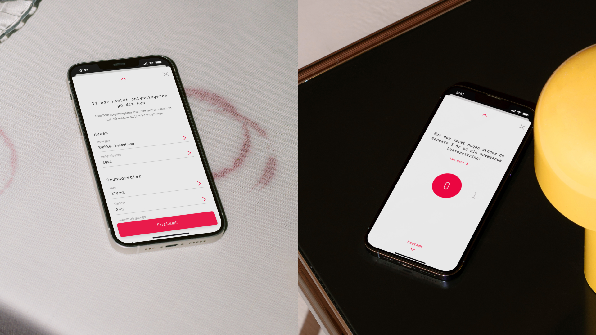

Onboarding and house info validation

Onboarding and risk model/pricing calculation
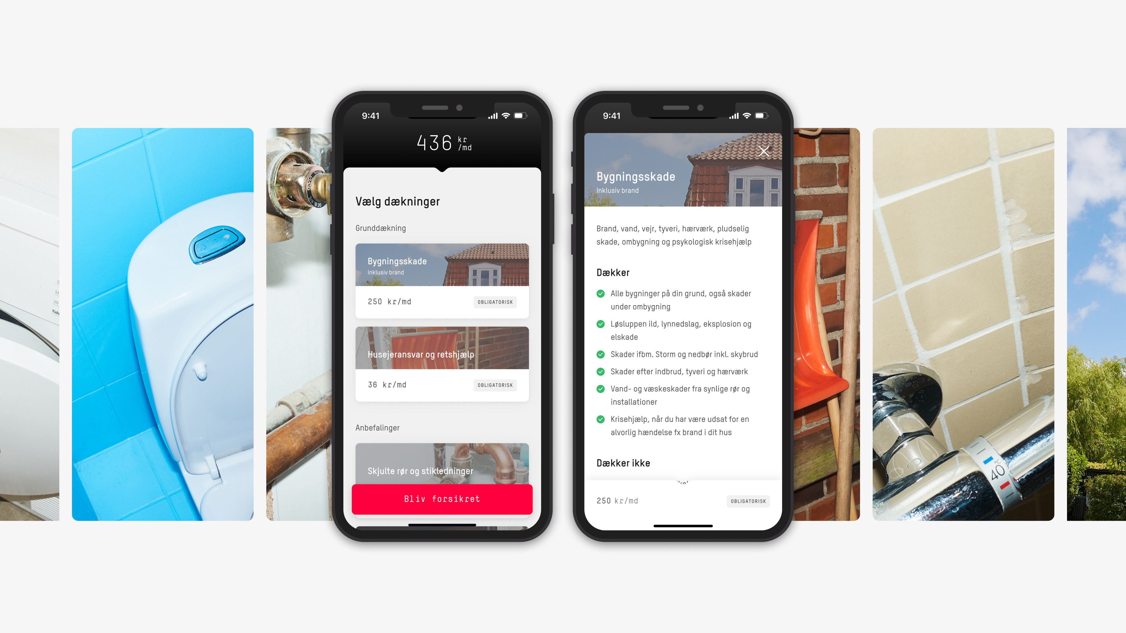
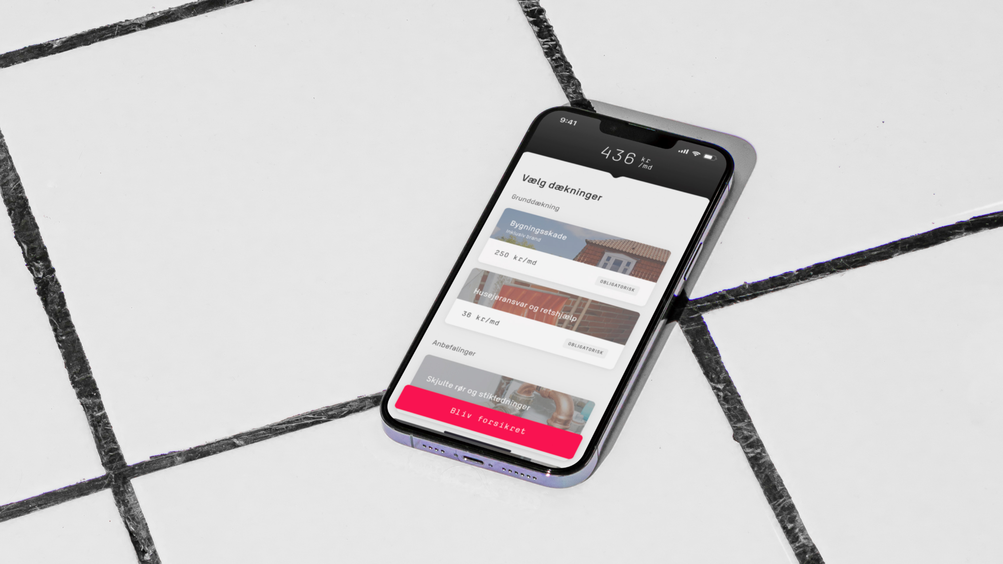
Customizing coverages and selecting deductible
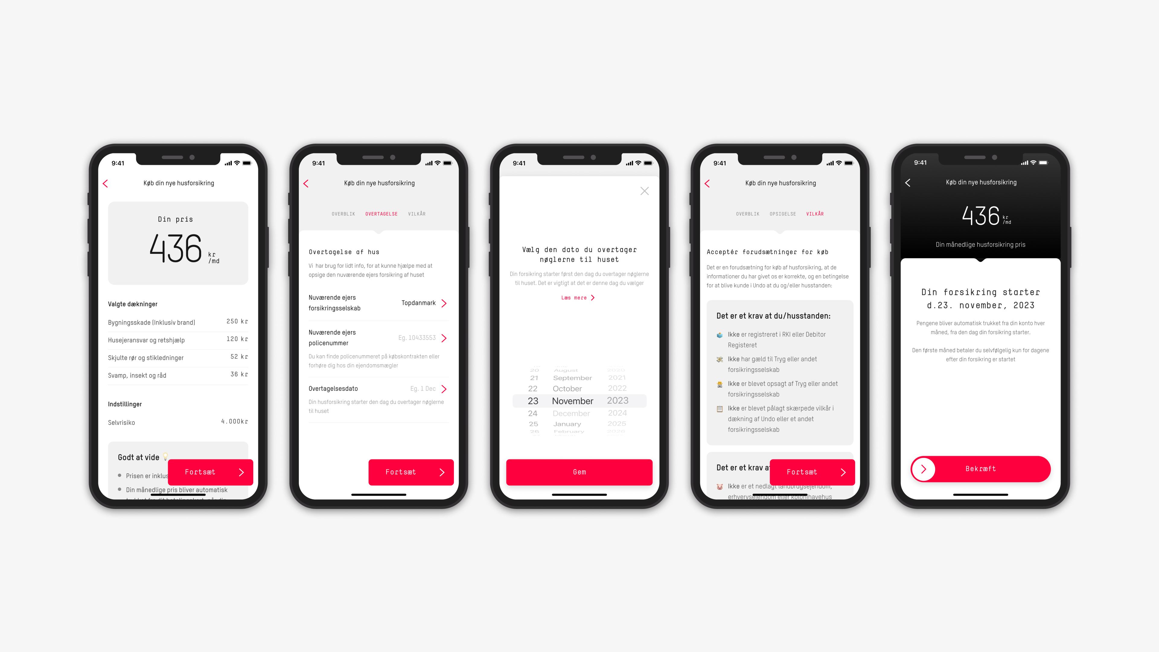
Shopping cart and purchase flow
This prototype was the foundation for internal stakeholder management/communication and external user testing.
The goal was for the customers to get a quote for house insurance, customize their coverage and purchase.
Given that it’s a test, that was originally given with context, the options within the prototype are limited.
The goal was for the customers to get a quote for house insurance, customize their coverage and purchase.
Given that it’s a test, that was originally given with context, the options within the prototype are limited.
It was estimated that introducing house insurance to the portfolio at the end of 2023 would reach our goal, by increasing our outcome by 38%
The Full story
Undo was launched in 2017 with a set of core insurance products (Content-, travel-, accident insurance). In 2021 car insurance was added to the portfolio.
In 2022 the commercial strategy of Undo was focused on continuous fast growth of the car insurance product, but to reach our long-term goal, a new big bet was needed for 2023.
The Foundation
The initial focus on quickly getting a product market fit for the car insurance meant that it was built in a separate app and in a different codebase. Since the audience was slightly older than the core products sold, it was also designed with different components in a separate design library. Although it was needed, to quickly get the product to market, it led to unwanted complexity for both users, developers and internal operations.
The Commercial strategy
Company-wide strategy work including research and workshop efforts led to the conclusion that offering house insurance, competitive in price, and with a focus on heightened user experience would increase value per customer enough to meet our commercial goal.
It was estimated that introducing house insurance to the portfolio at the end of 2023 would increase our outcome by 38% This was due to the house insurance itself being a high-premium product that drives substantial growth, but also allows for the upselling of core insurance to more car customers, expanding our addressable market and likely reduces churn.
The Product strategy
The setup with two apps provided a lot of challenges. With good reason. The apps were built with very different purposes and in different codebases/design libraries.
As a part of our challenge to reach our commercial goal, we decided a merge of the two apps was needed, to enable us to launch the new product faster, adapt our current offerings to match the needs of our target segment, create new experiences and iterate on existing ones.
For the customer, this would also provide a more effortless user experience, when managing their insurance and buying new ones.
Besides removing pains for the customers and product development, it would also make it easier for our OPS teams to support our customers and make the sales team more efficient.
In the product team, we assessed the foundation and design/tech challenges, and presented it to stakeholders, mapping out the pros and cons of each option. Migrating to a completely new app or building a house insurance into either our core or car insurance app.
Our Proposal
Incrementally rebuilding the car insurance app into one Undo app while tweaking the information architecture to accomodate new additional products.
The Reasonening
Undo was launched in 2017 with a set of core insurance products (Content-, travel-, accident insurance). In 2021 car insurance was added to the portfolio.
In 2022 the commercial strategy of Undo was focused on continuous fast growth of the car insurance product, but to reach our long-term goal, a new big bet was needed for 2023.
The Foundation
The initial focus on quickly getting a product market fit for the car insurance meant that it was built in a separate app and in a different codebase. Since the audience was slightly older than the core products sold, it was also designed with different components in a separate design library. Although it was needed, to quickly get the product to market, it led to unwanted complexity for both users, developers and internal operations.
The Commercial strategy
Company-wide strategy work including research and workshop efforts led to the conclusion that offering house insurance, competitive in price, and with a focus on heightened user experience would increase value per customer enough to meet our commercial goal.
It was estimated that introducing house insurance to the portfolio at the end of 2023 would increase our outcome by 38% This was due to the house insurance itself being a high-premium product that drives substantial growth, but also allows for the upselling of core insurance to more car customers, expanding our addressable market and likely reduces churn.
The Product strategy
The setup with two apps provided a lot of challenges. With good reason. The apps were built with very different purposes and in different codebases/design libraries.
As a part of our challenge to reach our commercial goal, we decided a merge of the two apps was needed, to enable us to launch the new product faster, adapt our current offerings to match the needs of our target segment, create new experiences and iterate on existing ones.
For the customer, this would also provide a more effortless user experience, when managing their insurance and buying new ones.
Besides removing pains for the customers and product development, it would also make it easier for our OPS teams to support our customers and make the sales team more efficient.
In the product team, we assessed the foundation and design/tech challenges, and presented it to stakeholders, mapping out the pros and cons of each option. Migrating to a completely new app or building a house insurance into either our core or car insurance app.
Our Proposal
Incrementally rebuilding the car insurance app into one Undo app while tweaking the information architecture to accomodate new additional products.
- Starting with preparing a technical foundation that supports multiple products. (Also prep IA, navigation and update/reuse design library)
- Introduce a new product into the app (House).
- Migrate the Core products to the new app.
The Reasonening
- The fastest way to support our Commercial Strategy
- Incremental steps to our Product vision of one app
- The product team stays the main drivers
- The fastest way to get learnings on all parameters of production
- Everyone is already onboarded into the car app.
We aimed to be in a position where we would be much better at estimating the overall project timeline while having more confidence in our releases
The Process
We wanted to minimise the risk of the house launch timeline slipping and the risk of rushing out House in a poor state where we would have had to do day-2-day and bug fixing for a cycle or two after launch.
By releasing an MLP House experience in smaller increments instead of working towards one big release, we hypothesised that we would be able to prove parts of the experience from a technical and customer point-of-view early, while also getting important feedback on viability, usability and desirability.
A big factor in this was that we estimated, based on competitor analysis, that around 30% of our customers would need an inspection (desk/field), before they could be rejected or accepted. At this point, the inspection work was blocked by external stakeholders, which led to the focus on the waitlist, buying us time.
Furthermore, we would be in a position where we would be much better at estimating the overall project timeline while having more confidence in our releases as the project progresses.
Step-by-Step
One app
A small cycle was started up, before kicking off the house insurance, which focussed on the information architecture and navigation. Through user interviews and user testing of early prototypes. A lot of exploration work was reviewed by the product-, design- and sales teams, before being tested out on users, to align on technical feasibility, best practices and opportunities for growth.
This led to the insight, that our customers wanted to be able to have the same flexibility as with any other shopping experience. They wanted to add to the cart or remove, purchase immediately or save for later, instead of having to buy one product at a time, as it usually is with insurance products
These insights were used to define our direction for the technical foundation of the introduction of the new product but were described in the front end, where we opted to reuse current implemented components, to save time and be able to launch and learn as fast as possible.
We wanted to minimise the risk of the house launch timeline slipping and the risk of rushing out House in a poor state where we would have had to do day-2-day and bug fixing for a cycle or two after launch.
By releasing an MLP House experience in smaller increments instead of working towards one big release, we hypothesised that we would be able to prove parts of the experience from a technical and customer point-of-view early, while also getting important feedback on viability, usability and desirability.
A big factor in this was that we estimated, based on competitor analysis, that around 30% of our customers would need an inspection (desk/field), before they could be rejected or accepted. At this point, the inspection work was blocked by external stakeholders, which led to the focus on the waitlist, buying us time.
Furthermore, we would be in a position where we would be much better at estimating the overall project timeline while having more confidence in our releases as the project progresses.
Step-by-Step
- Build foundation and business logic through discovery work, and define the rules for inspection, requirements for purchase, Claims handling, price model and pre-requisites for purchase.
- Create a waitlist that helps us build up the sales funnel and test the onboarding
- Launch and open up for purchase for those of our current car customers who have signed up with the waitlist, and that does not need an inspection.
- Build inspection flow, and start selling to the part of the waitlist that needs an inspection.
- Build the full onboarding for house-only or multiple products to allow us to push sales and marketing for all customers.
- Migrate core products and travel into the app, while rebranding the app.
- Rethink the IA and navigation of the one app, to improve user experience and cross-selling.
One app
A small cycle was started up, before kicking off the house insurance, which focussed on the information architecture and navigation. Through user interviews and user testing of early prototypes. A lot of exploration work was reviewed by the product-, design- and sales teams, before being tested out on users, to align on technical feasibility, best practices and opportunities for growth.
This led to the insight, that our customers wanted to be able to have the same flexibility as with any other shopping experience. They wanted to add to the cart or remove, purchase immediately or save for later, instead of having to buy one product at a time, as it usually is with insurance products
These insights were used to define our direction for the technical foundation of the introduction of the new product but were described in the front end, where we opted to reuse current implemented components, to save time and be able to launch and learn as fast as possible.
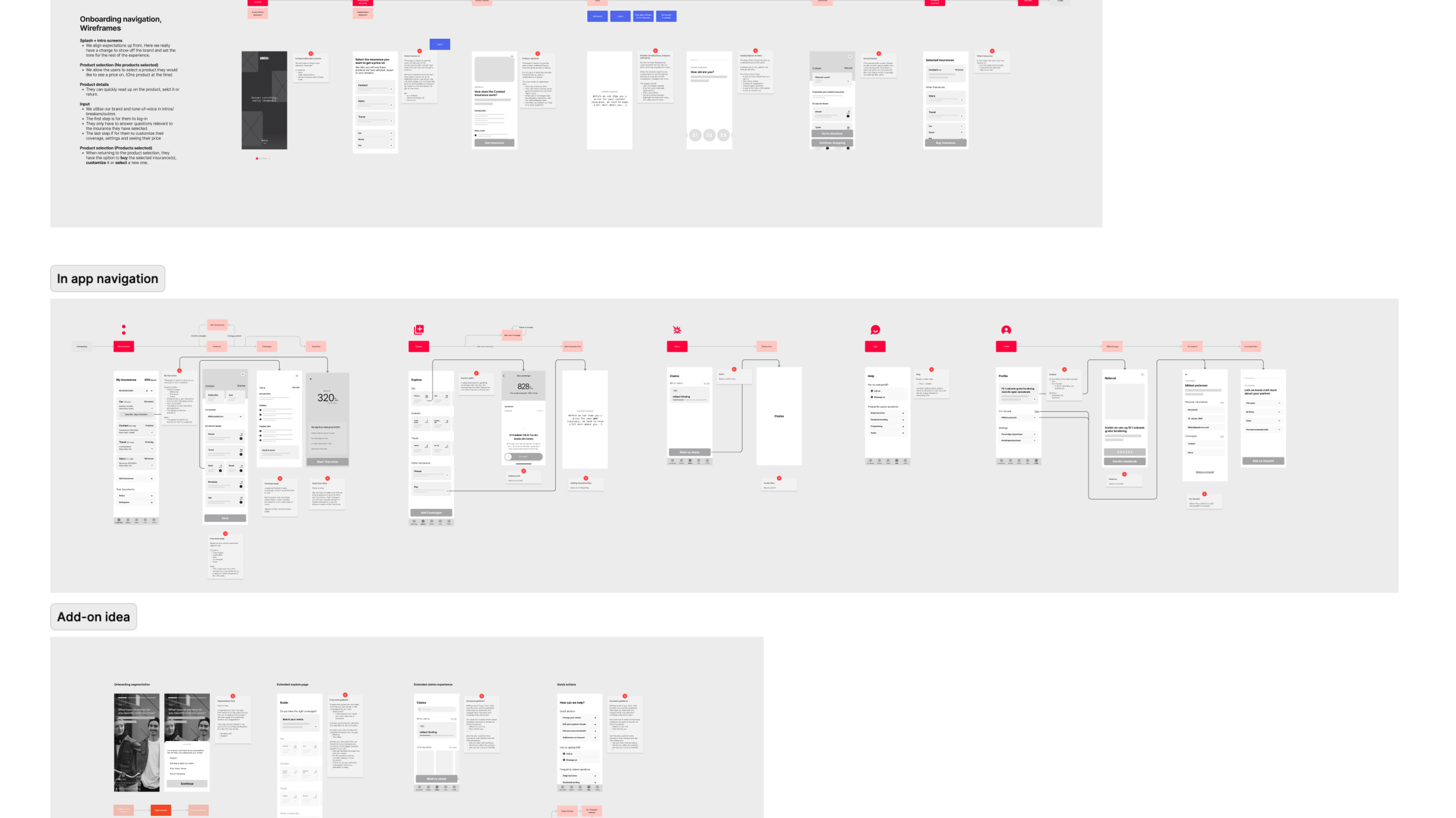
Fig. 1
Wireframming, focussing on the IA and navigation of the overall onboarding and in-app usage.
Wireframming, focussing on the IA and navigation of the overall onboarding and in-app usage.
The Waitlist
As mentioned, the goal of the waitlist was to build up a pipeline of leads on current customers that would not require an inspection of their house before purchase.
For us to be able to build the leads, we needed to be able to divide the customers into different buckets through the sign-up.
Through internal and external stakeholder meetings, we gathered info on requirements for purchase and risk-profiles to figure out the right balance of who to sell to (no more than 2 claims done in previous house, no prior debt to insurance companies etc.) and which houses to sell to (No listed-, half-timbered or summer houses etc.)
We used this information to draw up a decision tree of the questions/answers needed, and a service blueprint of how to handle this information in the front- and backend.
It was then mapped out in a flow to get a better overview, and after reviews mocked up in low fidelity wireframes. The wireframes were then evaluated using the psych framework, giving us an idea of the low and high peaks of the user experience.
After more reviews and interactions, this was tested through user interviews and with a prototype.
As mentioned, the goal of the waitlist was to build up a pipeline of leads on current customers that would not require an inspection of their house before purchase.
For us to be able to build the leads, we needed to be able to divide the customers into different buckets through the sign-up.
- Customers who can buy house insurance without inspection (non-inspection)
-
Customers whose house needs an inspection (inspection)
-
Customers whose houses we do not cover (rejection)
- Customers who don’t have a house, or are just interested (other)
Through internal and external stakeholder meetings, we gathered info on requirements for purchase and risk-profiles to figure out the right balance of who to sell to (no more than 2 claims done in previous house, no prior debt to insurance companies etc.) and which houses to sell to (No listed-, half-timbered or summer houses etc.)
We used this information to draw up a decision tree of the questions/answers needed, and a service blueprint of how to handle this information in the front- and backend.
- Inspection logic
- Chatbot questions about address, number of claims on current policy, etc.
- Fetching information from Bygnings- og Boligregistret (The Building and Housing Register) + enabling the user to verify the data pulled in.
- Rejection logic
- General rules based on BBR information (e.g. roof type)
- Fetching information about potential purchase on foreclosure.
It was then mapped out in a flow to get a better overview, and after reviews mocked up in low fidelity wireframes. The wireframes were then evaluated using the psych framework, giving us an idea of the low and high peaks of the user experience.
After more reviews and interactions, this was tested through user interviews and with a prototype.

Fig. 2
Service blueprint of the waitlist experience, showing how the information is pulled from BBR and handled by the different teams within the organisations.
Service blueprint of the waitlist experience, showing how the information is pulled from BBR and handled by the different teams within the organisations.
Fig. 3
Flows showing how a customer is being sorted based on their answers and input.
Flows showing how a customer is being sorted based on their answers and input.

Through the feedback from the user testing we concluded that even though the flow was already shorter than the competitors, the customers were still expecting more from us. The flow was working as intended but “felt” slightly too long. With this insight, we went back to the internal stakeholders and presented a second version, tested out on the users, that was perceived as shorter, by omitting a question (sales could get elsewhere), grouping others and tweaking the duration of loading steps.
We did a soft launch, and then gradually started introducing the marketing channels. We monitored the signups through an amplitude dashboard (+ slack integration) and saw a steady increase in leads, which only increased more rapidly once the marketing emails started being sent out.
The tracking showed us a low drop off, except for an initial bounce off, that the user interviews told us was customers wanting to be able to read a bit more about the house insurance, before signing up. Besides that, the response to the sign-up experience was good.
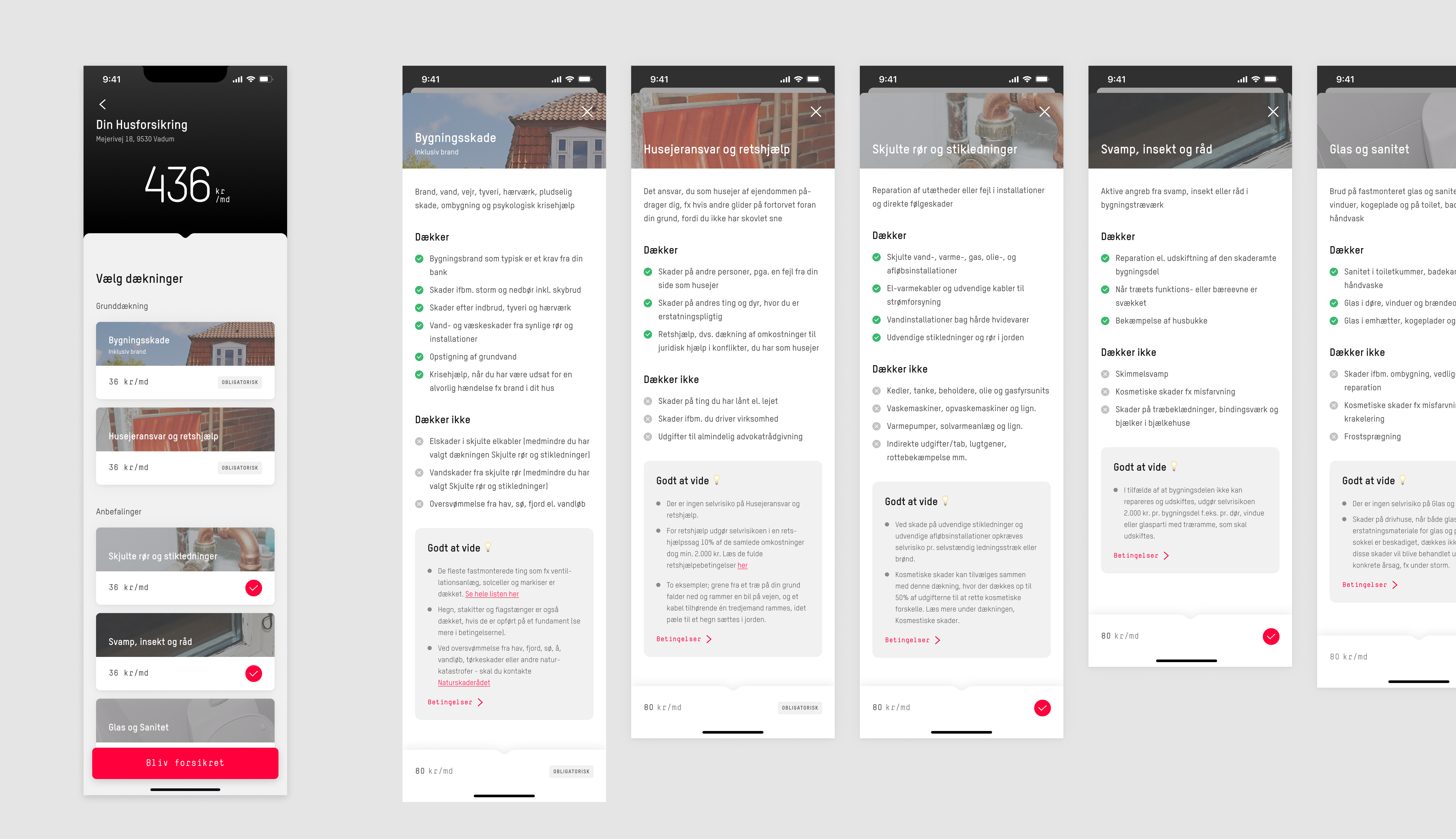
Fig. 4
Customizing the insurance offer, Coverages and deductible.
Customizing the insurance offer, Coverages and deductible.
Customize and purchase
With the learnings from the waitlist, we spotted a couple of things we could omit, and some we needed to add. We had luckily expected this and built the flows in a way that required the customers to validate their information when going from the waitlist to purchase.
We created a push/email communication lane, that led to the iterated house onboarding flow, that was only sent out to customers that had signed up with the waitlist and did not need inspection.
Most within the waitlist flow could be reused but copy changes were needed to help the customers understand that they were signing up to get a quote with the potential to buy the insurance.
At the end of the onboarding of the customers, we reused components from our car insurance to show the customers their prices and be able to customize their insurance. Pages and components that were already tested and validated.
We still had to update and add fact sheets/terms & conditions/policies, so they matched the house insurance.

Fig. 5
A user test repport from Maze, giving us miss clicks, succesrates, duration and heatmap
A user test repport from Maze, giving us miss clicks, succesrates, duration and heatmap
What was not yet validated was our purchase flow. Through stakeholder meetings with internal claims teams, we knew that the requirements were too different from current flows to rely on the testing done for previous products.
So we set out to test the purchase flow. Here I spoke to 12 house owners who had bought a house and new insurance within the last 6 months, including Interviews to follow up our maze prototype/survey.
The Maze reports gave us good quantitative input, through miss clicks, success rates, duration and heat maps, while the follow-up questions gave us qualitative input.
The conclusion was, that the purchase flow was to navigate and clear and concise. The interviewees knew where to get the information they needed, and what the terms they agreed to were. In other words, and understood purchase.

Fig. 6
Purchase flow for changing house insurance
Purchase flow for changing house insurance
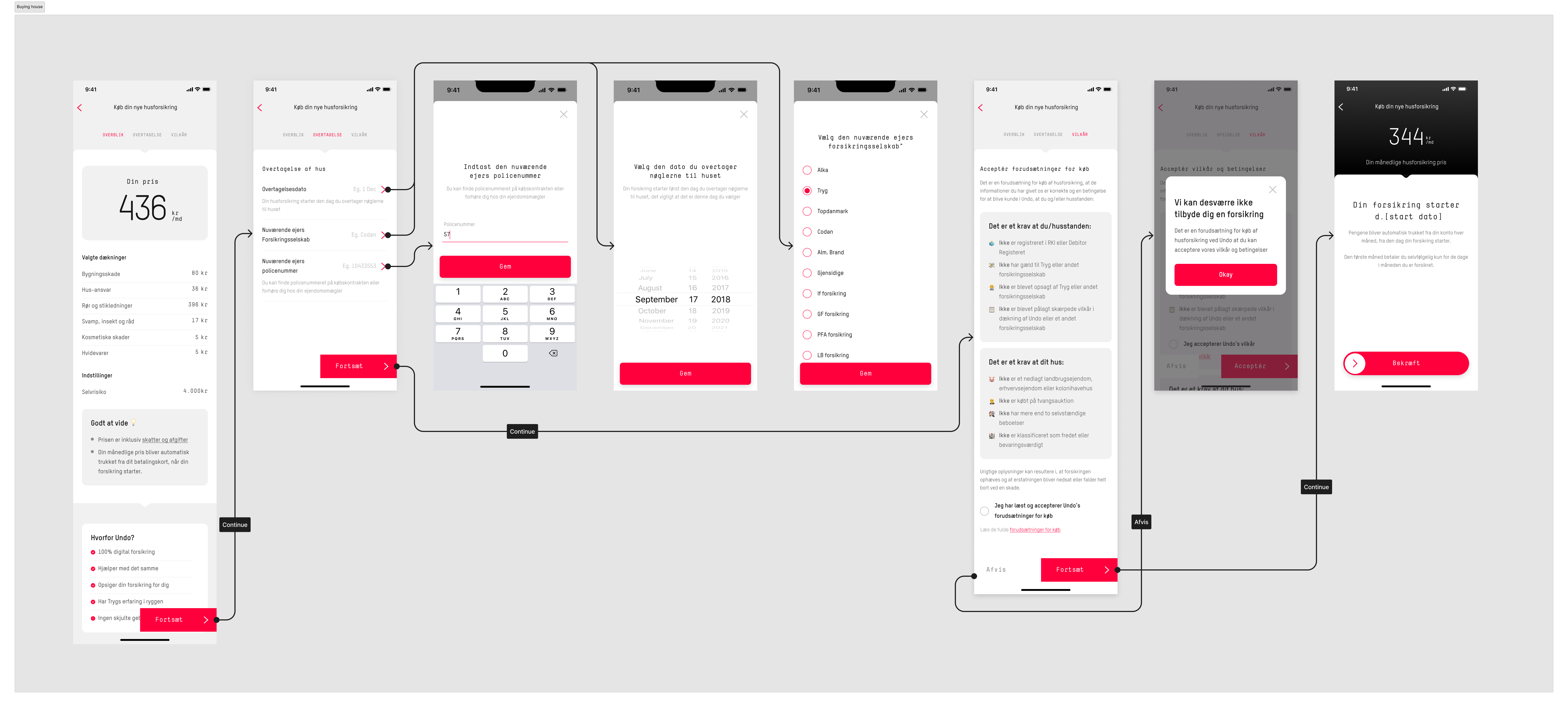
Fig. 7
Purchase flowm for when buying a house, and taking over a house insurance.
Purchase flowm for when buying a house, and taking over a house insurance.
The insights we gathered were communicated in a report to the broader team. I also did a video walkthrough of the full experience, that was sent to boards and the legal team for a final sign-off.
Since we had been in constant communication, the feature “passed” and I wrapped up the design in Figma for a final handover, which is displayed at the top of the case.
Since we had been in constant communication, the feature “passed” and I wrapped up the design in Figma for a final handover, which is displayed at the top of the case.
Fig. 8
An example of the video walkthrough I made for stakeholders as a part of a larger legal review
An example of the video walkthrough I made for stakeholders as a part of a larger legal review

Conclusion and Perspective
Unfortunately, the company was bought off by its “mother company” at the end of 2023, and all product development was discontinued.
We had already done a whole exploration cycle on the inspection experience, by visiting the 3rd party companies that were to help us. We tagged a long for a day with the field inspectors and created a report for the team at home. The same was the case for the claims team that was to handle the incoming claims
New cycles and plans had been developed for monitoring and iterating on the house insurance to make sure that it reached a product market fit, and saw the growth we needed.
We had even started educating our customer service team.
At this point, we had met our deadlines and the milestones we set. We were on the right trajectory.