

C.7 Creating a flexible design system
The Challenge
We’ve introduced a lot of new features over the years. This has added both value and early learnings, but also impacted the technical work that has had to change and adapt over time, leaving the design- and development team with technical debt.
While it’s normal for a product team in the early state to sacrifice for agility, this has ultimately left the user experience less coherent and consistent than desired. We needed a better foundation to avoid, that a larger portion of the team’s energy was being spent on working around the current components and having to compromise instead of focusing on solving user needs, and providing an optimal experiences.
The Challenge
Creating a consistent, flexible and scalable design system, designed with and for the developers and with our end users in mind.
We’ve introduced a lot of new features over the years. This has added both value and early learnings, but also impacted the technical work that has had to change and adapt over time, leaving the design- and development team with technical debt.
While it’s normal for a product team in the early state to sacrifice for agility, this has ultimately left the user experience less coherent and consistent than desired. We needed a better foundation to avoid, that a larger portion of the team’s energy was being spent on working around the current components and having to compromise instead of focusing on solving user needs, and providing an optimal experiences.
My Role
Senior product designer:
Visual research
Design System creation
Brand design adaption
Prototyping
Design Reviews
Presenting
Senior product designer:
Visual research
Design System creation
Brand design adaption
Prototyping
Design Reviews
Presenting
Sprint type
Discovery sprint
Design and prototype different solutions directed by the strategy. Test and learn, to validate work and direction.
Discovery sprint
Design and prototype different solutions directed by the strategy. Test and learn, to validate work and direction.
My Story
I began as the first Product Designer, eventually moving up to Senior design role as both the scope of the projects and the team grew.
As Senior Product Designer at Tonsser, I helped to grow the company since its earliest days, and I created the core experience for iOS, Android that is still the foundation of the product today. This case study spans the exploration and creation of the Tonsser design language (North Star) and covers the design process, and my role in it.
The Product
In short, Tonsser let’s football players track their stats and showcase their potential to the world. It’s a utility tool, a vertical social platform and a marketplace, where scouts and clubs can discover previously hidden talents. It’s aim is to democratise football and even the playing field. At its core it empowers players to log their match performances, monitor their progression, set goals and take control of their own football career.
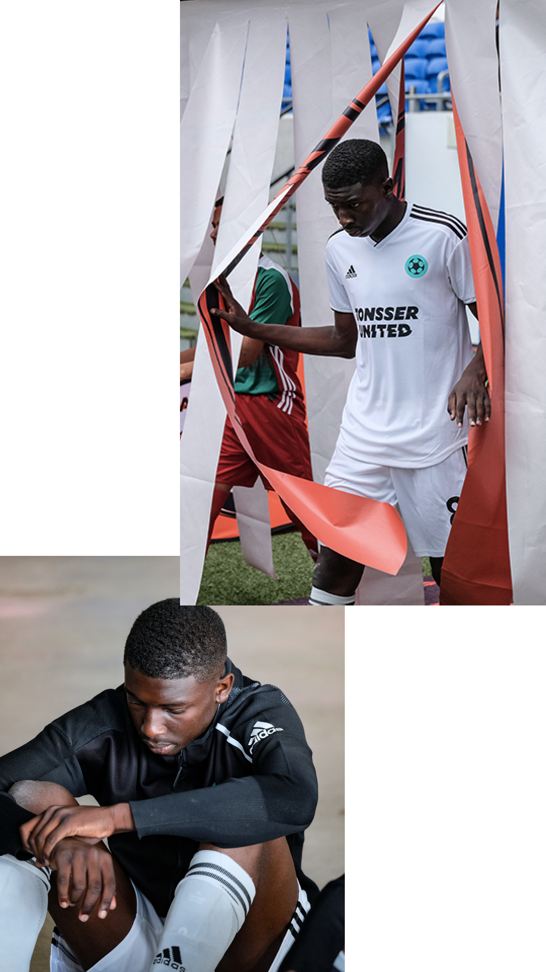
Tonsser, Football App
I began as the first Product Designer, eventually moving up to Senior design role as both the scope of the projects and the team grew.
As Senior Product Designer at Tonsser, I helped to grow the company since its earliest days, and I created the core experience for iOS, Android that is still the foundation of the product today. This case study spans the exploration and creation of the Tonsser design language (North Star) and covers the design process, and my role in it.
The Product
In short, Tonsser let’s football players track their stats and showcase their potential to the world. It’s a utility tool, a vertical social platform and a marketplace, where scouts and clubs can discover previously hidden talents. It’s aim is to democratise football and even the playing field. At its core it empowers players to log their match performances, monitor their progression, set goals and take control of their own football career.
The aim is to democratise football and even the playing field
Tonsser, Football App
What
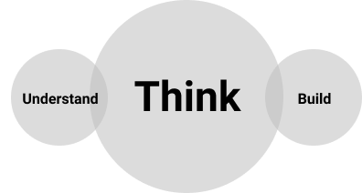
This case was mainly a question of solving a technical problem while continuing to deliver value to our users, with a tight deadline. We had quite a big Information Architecture sprint overlapping, but we fought to have the first overall framework and the needed components ready and agreed on before kicking off the sprint, that would eventually use the new components based on our initial work
Our aim for the design language was to create a a solid foundation on which to base all future design on, and in order to do so we realised early on, that we needed it to to be a technical blueprint for our UI and a flexible framework, that could easily be branded, with future DNA elements: colours, typography, gradients, images, icons etc.
It needed to be our North star, a vision for the product to help gather the team around and to navigate by
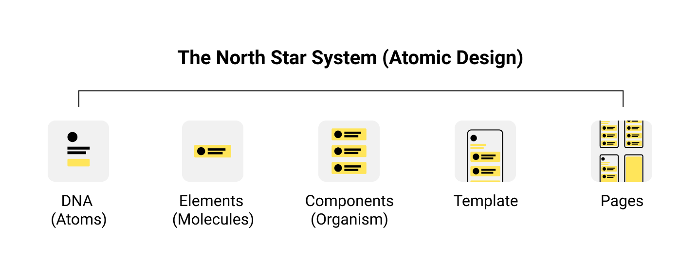
Before the kickoff, we agreed to follow the core principles of the atomic design framework, but continue to adapt it to our process and needs. This was done based on insights from discussions with the tech-team. We needed a DNA/component based setup, in order for them to build for scale.
Some of the causes leading to the need for design language, was that changes in the development team and early design choises had led to several card systems, that was not compatible. Therefore, at big focus for us in the rewamp was to ensure that what we build was future proof. By choosing the Atomic Design System as a base, we ensured that future changes to the DNA, would easely be branched out into all corners of the design. With our limited time, we could then focus mostly on the base, without worrying about what would happen when tweaking the UI later on.
Some of the causes leading to the need for design language, was that changes in the development team and early design choises had led to several card systems, that was not compatible. Therefore, at big focus for us in the rewamp was to ensure that what we build was future proof. By choosing the Atomic Design System as a base, we ensured that future changes to the DNA, would easely be branched out into all corners of the design. With our limited time, we could then focus mostly on the base, without worrying about what would happen when tweaking the UI later on.
The North Star
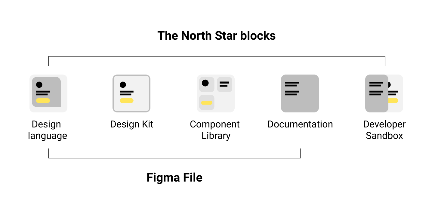
Technically The North Star is aimed to be a set of design files, with thorough documentation, built to be the one true shared truth, while simultaneously living in code.
Technically The North Star is aimed to be a set of design files, with thorough documentation, built to be the one true shared truth, while simultaneously living in code.
Why
Below are some of the areas we worked to improve with the new design language. 4 Pillars, that we believe can ultimately lead to accelerated innovation, by allowing us to move through the process much smoother. And in continuation of this we are able to focus on delivering a hightened and holistic user experience.
Streamlined Workflows:
Team Collaboration:
Integrated Governance:
Quality Assurance:
Below are some of the areas we worked to improve with the new design language. 4 Pillars, that we believe can ultimately lead to accelerated innovation, by allowing us to move through the process much smoother. And in continuation of this we are able to focus on delivering a hightened and holistic user experience.
Streamlined Workflows:
- Much smoother handover processes as no new slightly changed UI or Patterns
Team Collaboration:
- Peace of mind and clarity. A feeling that comes with such collaboration
- Designed WITH developers.
- Documentation WITH developers.
- Easy presentation and collaboration with stakeholders.
Integrated Governance:
- Updates and changes are easely spotted
- One source of truth
- Responsibility being divided between developers and designers.
Quality Assurance:
- UX Writing will be elevated and included as a prioritisation (This will help us scale much more easily)
- Accessibility accounted for
- Android, not an afterthought.
- All states accounted for and examples of use noted
The Process
Initial Explorations:
We kicked this phase off with an open working session, where we discussed our vision, goals and other visual directions, products, elements and patterns that we love.
My inspiration for the directions I presented was based on a competitor analysis done in collaboration with our PM, our insights into the users product habits from user personas, made by our research team and our knowledge of the vision set for our product.
Nike Running
Often used by our players
Often used by our players
- Dark / Light themes
- Visual treatments
- Type
- Use of space
- Colour palette
- Bold contrast
Strava
Similar vision for data usage
Similar vision for data usage
- Great visualisation
- Color for emphasis
- Good type hierarchy
- Tailored feel
AirBnB
Strong design language
Strong design language
- Clear and consistent
- Use of space
- Great design DNA
- Clear patterns
- Good use of UGC images
- Great icon design, animations and transitions

Product exploration: I was mostly inspired by the bold use of fonts (Nike), the unified iconography (Apple books), the elevated UX writing + use of space (Airbnb) and the data visualisation (strava)
With this new design direction, we wanted to create a contemporary UI, that could tie the user experience together, and that we could easily build on top off, to accommodate for future iterations based on insights and feedback.
To help with this, we agreed to base our design language on a clean and straightforward user interface. One that could allow for complex problem-solving, together with clear CTAs and consistent interaction patterns to guide the users and help them make informed decisions.
To help with this, we agreed to base our design language on a clean and straightforward user interface. One that could allow for complex problem-solving, together with clear CTAs and consistent interaction patterns to guide the users and help them make informed decisions.
The most important part of this overhaul was to reduce the technical debt and to align on a flexible design framework
DNA & Elements
After the initial exploration of design directions and research, we gathered our suggestions and had a couple of sessions in the design team, to create a shared Core DNA file to outline the basics of our new UI/language.
We settled on three pages in the current product, that had the core components represented, and then used those as a shared base for our explorations. We did this to ensure that we kept our solutions focused on the product. These were also pages that were core to the users experience and that we knew needed attention in future sprints.
![]()
In these exploration sessions we gave each other space and time to try out ideas, ideate and refine until we had our design principles and a direction that we were all aligned on.
Design direction:
We were luckily all quite aligned on the broader picture from the get go. These directions went through several versions, critique-sessions and discussion before the final options were decided upon, with feedback from developers and the broader team.
After the initial exploration of design directions and research, we gathered our suggestions and had a couple of sessions in the design team, to create a shared Core DNA file to outline the basics of our new UI/language.
We settled on three pages in the current product, that had the core components represented, and then used those as a shared base for our explorations. We did this to ensure that we kept our solutions focused on the product. These were also pages that were core to the users experience and that we knew needed attention in future sprints.
In these exploration sessions we gave each other space and time to try out ideas, ideate and refine until we had our design principles and a direction that we were all aligned on.
Design direction:
- Bold fonts
- Less cognitive load in the UI
- Clear and focused CTAs
- Understandable and consistent interaction patterns (such as transitions, loading)
- Elevated UX Writing
- Focused and guarded Information-/ and navigation architecture
- More space and breathing room for content
- Unified and modernised iconography
- Support for light/dark themes.
We were luckily all quite aligned on the broader picture from the get go. These directions went through several versions, critique-sessions and discussion before the final options were decided upon, with feedback from developers and the broader team.
DNA
Following are the DNA and Elements I presented to the team, for our shared Core DNA file.
Typography:
The Text-styles that was already used client-side, was a typographic hierarchy I had build a couple of years prior. All body fonts and most titles was using the native options for both platforms (Android: Roboboto & iOS: San Fransisco), while Some cards and headers that needed extra focus, were using the Tonsser Brand font: Mallory Ultra (a very bold sans serif font with destinct sharp features).
Since the current hirarchy was working quite well, and already implemented, I suggested that we use that as a base, but tweaked it to suit our new direction.
For the display fonts, I played around with different alternatives to the Mallory brand font
Druk wide: (suggested my codesigner Paco). Trendy wide font. Well used by both adidas and nike, for their campaings. The wide aspect would require us to rethink some headers and title, and the font-family came with quite the price tag.
New york: A serif headline to give contrast t to the sans serif body text. Free to use.
ABC Favorit Lining: A bit of a curveball, from a small type foundry. Cheap to use. Lighter than the rest, but very destinct. Has 2-3 different sets with different custom underlines. Could help the brand stand out, but might in the end not feel dynmic enoug for our use.
Mallory: Already bought and paid for, but under used in the product. Bold, destinct. Known by our audience, but perhaps if we use it in a different way.
Following are the DNA and Elements I presented to the team, for our shared Core DNA file.
- Typography: Bold fonts
- Colors: Support for light/dark themes.
- Spacing: More space and breathing room for content
- Iconography: Unified and modernised
Typography:
The Text-styles that was already used client-side, was a typographic hierarchy I had build a couple of years prior. All body fonts and most titles was using the native options for both platforms (Android: Roboboto & iOS: San Fransisco), while Some cards and headers that needed extra focus, were using the Tonsser Brand font: Mallory Ultra (a very bold sans serif font with destinct sharp features).
Since the current hirarchy was working quite well, and already implemented, I suggested that we use that as a base, but tweaked it to suit our new direction.
For the display fonts, I played around with different alternatives to the Mallory brand font
Druk wide: (suggested my codesigner Paco). Trendy wide font. Well used by both adidas and nike, for their campaings. The wide aspect would require us to rethink some headers and title, and the font-family came with quite the price tag.
New york: A serif headline to give contrast t to the sans serif body text. Free to use.
ABC Favorit Lining: A bit of a curveball, from a small type foundry. Cheap to use. Lighter than the rest, but very destinct. Has 2-3 different sets with different custom underlines. Could help the brand stand out, but might in the end not feel dynmic enoug for our use.
Mallory: Already bought and paid for, but under used in the product. Bold, destinct. Known by our audience, but perhaps if we use it in a different way.


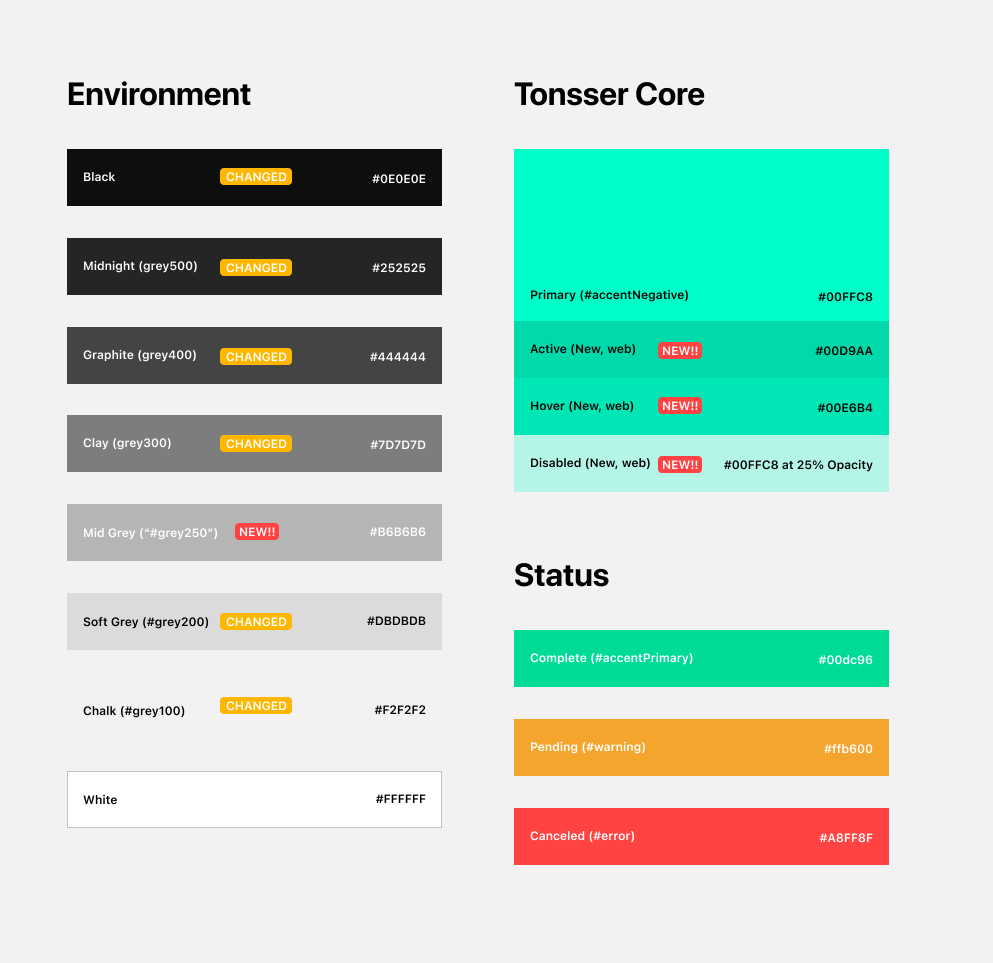
Colors:
It was the same story for the implemented color-scheme. It was working, but needed a cleanup. The Grey-scale all had a green hue to them, that had worked well previously with a data-heavy app, but was now interfering with the modernised branding and with the higher focus on content, it was clashing with the media in the product. But mostly the focus was on making sure that we were supporting dark and light theme, while iterating on a different tone for our green brand color, that was notoriously hard to use, but very destinct.
The fall back was, as mentioned, to clean up our current grey-scale and possibly tweak the green brand color.
But while we were giving ourself time to experiment and think big, I wanted to be bold and really challenge the main color, and at the same time playing around with adding an accent color. During the work with Tonsser throughout the years, I have experiences, how sticking to using a single primary color can be limiting, so I wanted to try and challenge this.
These combinations was inspired by other sports-, adventure- and fashion brands, but the focus was less on a brand redesign at this point, and more an exercise on the possibilities of creative and scalable use of colors.
Concept 1: Classic pairing
Concept 2: Off color pairings
Concept 3: Disturbing Color
Concept 4: High energy color + earth tone.

Spacing:
We knew we wanted the app to feel lighter and in the end give the users less cognitive load while using the product. This could to some extent be solved with the grid structure and spacing in the app, but eventually had to be adressed as a part of our UX work: Refocusing on the core, that aimed to adress the Information Architecture of the app.
I already knew that I wanted to push for adopting a 24px margin, instead of our current 16px, well aware that it together with bigger and bolder typograhy would pose challenges to the content in the current layout.
But initial tests had already showed, that moving “one step up” the typographic scale, would require us to do the same for the spacing, in order to balance it out.

Iconography:
The push for unified and modernised iconography, came from a setup that had grown slightly apart throughout the years. But as with the spacing, a lot of the growing pains came from the lack of a unified solution.
For this first round, I tried to focus on cleaning up our current icons, and set up rules for bounding box, hit areas and usage on images, gradients, solid colors (light/dark theme) etc.

Elements
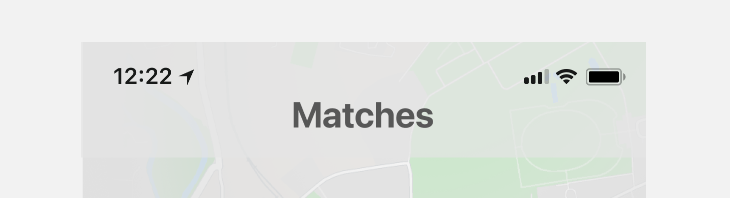
Navigation:
The most widely used navigation pattern in the app (and also the one used in the most amount of different styles), was the taps, so I started my focus here. I wanted them to be clear/unapologetic/bold, but at the same time giving room to the content when necessary (Om scroll)
![]()
Header
As with the tabs, my idea for the header was to go big and give it space to tell a story, and with the possiblity to give lent focus to the content, on scroll.
Going forward It further developed into giving space to different backgrounds and to a global header system, with room for icons.
![]()
![]()
Tab bar
In the current product, the dark tab bar stood out, on the light grey background used on all tab-pages. So my suggestion was to used a color much closer to the background color (going forward, for both light/dark theme), in order to lesson the cognitive load and allow the users to focus on the content.
![]()
Buttons
No global spec for the developers to use, no clear distinction of when to use what. So I went through the product and mapped out all the different buttons in use, and the different styles. By merging a lot of them, I got it down to 3 different sizes. Small (Lists, Buttons), Medium (Headers), Large (Full width).
With a new focus on spacing and a 24px margin, I wanted the buttons to help with onforcing the grid, and I felt that optically a slight rounded (4px) button “sat” batter in the layout, than the current (30px).
![]()
Input fields & PickersFor the input fields and pickers, I went through our current input flows, to asses the current major elements. 1. Input fields, 2. Custom pickers. For the input fields, I a reused the 4px corners from the buttons and created all the different stated (No input, Success, Error etc.). Since we have a couple of different pickers in the product, I chose to crate an arbitrary version, to show how a lot a spacing and bigger selectors could improve the overall feel.
![]()
Cards:
With the match card being the most core to the product, I tried to experiment with a minimal version of it, that could both work as a navigation tab and as a preview card. The checklist shown below it, I reimagined as a single card, that leads to an input overview, instead of trying to handle everything on the same match page.
![]()
Conclusion
Since the hierarchy was quite flexible already, our conclusion was that we would be able to land on our new design direction, with a tweaked version of our current hierarchies (for Colors, typography and spacing).
And while experiementing with it for the elements, we proved that we were not far off. The next step was putting it all together and testing it out on core pages.
- Less cognitive load in the UI
- Clear and focused CTAs
- Focused and guarded Information-/ and navigation architecture
Navigation:
The most widely used navigation pattern in the app (and also the one used in the most amount of different styles), was the taps, so I started my focus here. I wanted them to be clear/unapologetic/bold, but at the same time giving room to the content when necessary (Om scroll)

Header
As with the tabs, my idea for the header was to go big and give it space to tell a story, and with the possiblity to give lent focus to the content, on scroll.
Going forward It further developed into giving space to different backgrounds and to a global header system, with room for icons.

Tab bar
In the current product, the dark tab bar stood out, on the light grey background used on all tab-pages. So my suggestion was to used a color much closer to the background color (going forward, for both light/dark theme), in order to lesson the cognitive load and allow the users to focus on the content.

Buttons
No global spec for the developers to use, no clear distinction of when to use what. So I went through the product and mapped out all the different buttons in use, and the different styles. By merging a lot of them, I got it down to 3 different sizes. Small (Lists, Buttons), Medium (Headers), Large (Full width).
With a new focus on spacing and a 24px margin, I wanted the buttons to help with onforcing the grid, and I felt that optically a slight rounded (4px) button “sat” batter in the layout, than the current (30px).

Input fields & PickersFor the input fields and pickers, I went through our current input flows, to asses the current major elements. 1. Input fields, 2. Custom pickers. For the input fields, I a reused the 4px corners from the buttons and created all the different stated (No input, Success, Error etc.). Since we have a couple of different pickers in the product, I chose to crate an arbitrary version, to show how a lot a spacing and bigger selectors could improve the overall feel.

Cards:
With the match card being the most core to the product, I tried to experiment with a minimal version of it, that could both work as a navigation tab and as a preview card. The checklist shown below it, I reimagined as a single card, that leads to an input overview, instead of trying to handle everything on the same match page.

Conclusion
Since the hierarchy was quite flexible already, our conclusion was that we would be able to land on our new design direction, with a tweaked version of our current hierarchies (for Colors, typography and spacing).
And while experiementing with it for the elements, we proved that we were not far off. The next step was putting it all together and testing it out on core pages.
Templates and Pages
At this stage, we gathered up the design language elements and applied them to our core Tonsser screens, for a feedback round.
Below are the first screens I presented to the design team, with the DNA and Components applied to the core pages.
At this stage, we gathered up the design language elements and applied them to our core Tonsser screens, for a feedback round.
Below are the first screens I presented to the design team, with the DNA and Components applied to the core pages.

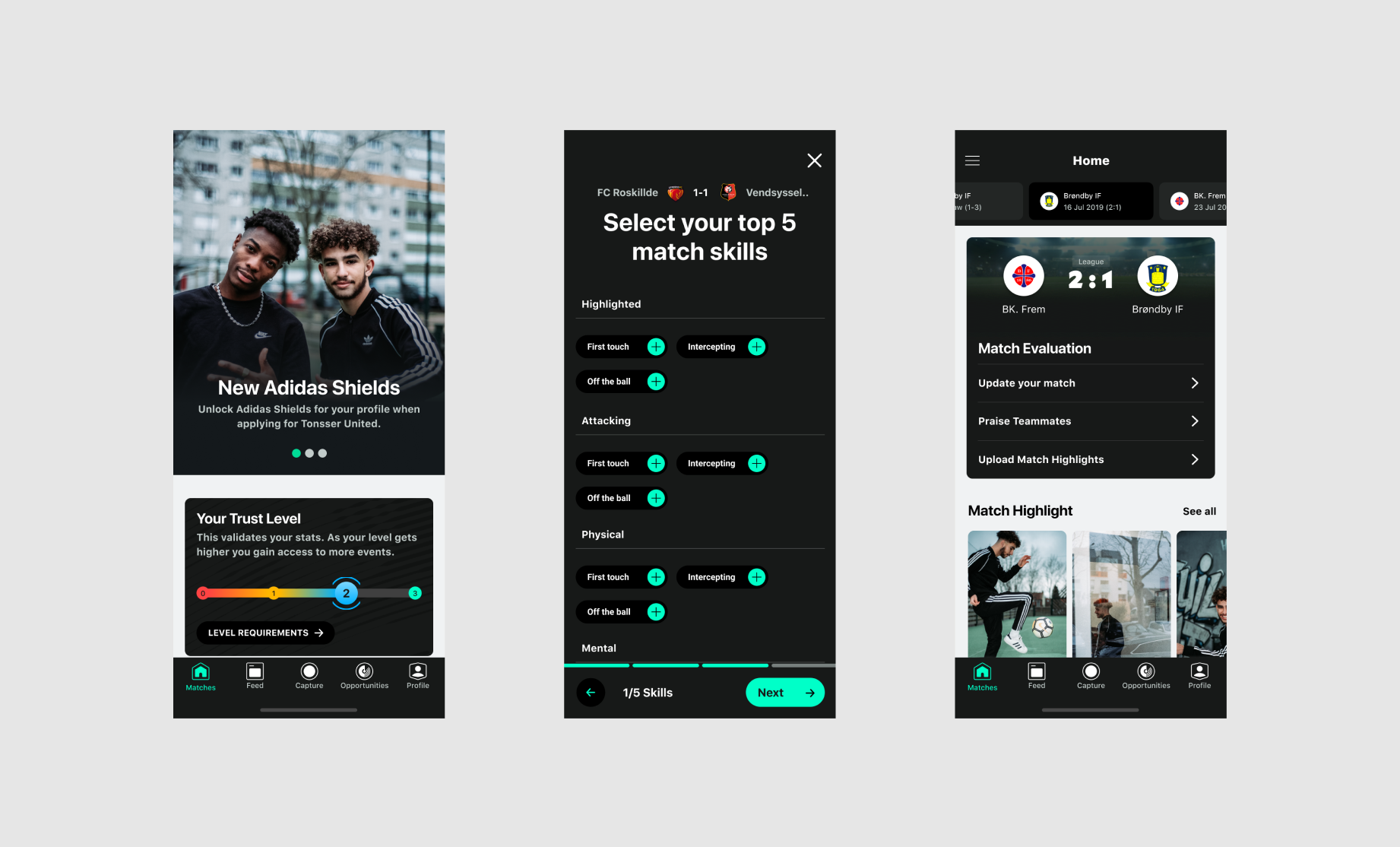
Left to right: Opportunities page, Skills selection flow & Match page.
For the templates and pages, I applied the DNA and Components, directly to the core pages, I took the liberty to tweak the navigation and the order of the elements, as the focus was not on the user experience here, but to showcase the DNA and components in a shared invironment and in the right context.
As we had had close cooperation through the process, there was not a lot of suprises for the team. The feedback was mainly on testing out the Dark/light theme, and focus on the Matches page (instead of the opportunities page) and as a part of that: The match card and Header.
I started by turning the input page into an input flow (by adding an intro page and a text input page). I did so, to give the team a better understanding of, how these pages could work together, and how they could potentially be used as a part of an onboarding flow, where the users focus would be on one tasks at the time, to allow the design to breathe, and minimise cognitive load
For the Matches page, I wanted to work on the transitions and global header. I focused in on the match card as the core for tonsser, and used that as a starting point. As my original experiement with a minimal version of the match card was challenged by my colleagues in the design team. I took inspiration from our head of design in the idea og highlihting the opponent.
To this, I added the idea of pulling the color from the logo and adding it to the background, as well as highlight one of their key players from the match (Automatically cutting out a person from an image is not impossible, but the quality from the user generated images varies so much, that this would most likely not be adviseble to try. It was although kept in to show the style we were going for. A style that had a lot of potential for other applications, where we were more in control of the content). As a final touch, I introduced a detail view to the match card. The ideas was to create an immersive experience, where the match card expands and transitions to a header card, so the users doesnt feel like they are removed from the Matches page. With this partial overlay, they can quickly navigate in and out of matches, and feel immersed into a single match, without being 3 layers deep in detail view.
![]()
I wanted to try and create a global header, that could work both for the main pages, and detail views, andon all types of background. I did so, by moving the title down below the header, and adding semi-transperent background to the icons. This would potentially allow the header to work on all our current pages, even with images added to the backgrounds.
![]()
As we had had close cooperation through the process, there was not a lot of suprises for the team. The feedback was mainly on testing out the Dark/light theme, and focus on the Matches page (instead of the opportunities page) and as a part of that: The match card and Header.
I started by turning the input page into an input flow (by adding an intro page and a text input page). I did so, to give the team a better understanding of, how these pages could work together, and how they could potentially be used as a part of an onboarding flow, where the users focus would be on one tasks at the time, to allow the design to breathe, and minimise cognitive load
For the Matches page, I wanted to work on the transitions and global header. I focused in on the match card as the core for tonsser, and used that as a starting point. As my original experiement with a minimal version of the match card was challenged by my colleagues in the design team. I took inspiration from our head of design in the idea og highlihting the opponent.
To this, I added the idea of pulling the color from the logo and adding it to the background, as well as highlight one of their key players from the match (Automatically cutting out a person from an image is not impossible, but the quality from the user generated images varies so much, that this would most likely not be adviseble to try. It was although kept in to show the style we were going for. A style that had a lot of potential for other applications, where we were more in control of the content). As a final touch, I introduced a detail view to the match card. The ideas was to create an immersive experience, where the match card expands and transitions to a header card, so the users doesnt feel like they are removed from the Matches page. With this partial overlay, they can quickly navigate in and out of matches, and feel immersed into a single match, without being 3 layers deep in detail view.

I wanted to try and create a global header, that could work both for the main pages, and detail views, andon all types of background. I did so, by moving the title down below the header, and adding semi-transperent background to the icons. This would potentially allow the header to work on all our current pages, even with images added to the backgrounds.

Final Presentation
At this stage, we wrapped up the North Star design elements for a company-wide presentation.
The whole presentation was very well received by the stakeholders and the wider team, which gave us the buy-in we needed, to developing it further.
The work is, of course, never finished - but with an aligment here, the kick-off phase ended and the real work of developing the language further, pushing it into the product and maintaining it started
Below is the final version for the presentation, with: Match Page, Detail view and Input flow, in Light and dark theme.

An ongoing process
The process of adding or correcting Components:
The design language is never ‘finished’, just levels of maturity. Like the product it evolves and adapts as we do but we aim here to have core building blocks decided upon so it can be comfortably used in a product sprint and enter production.
The process of adding or correcting Components:
- The designer produces an initial proposed new component(s)
- Sets a meeting with NS Ambassadors to feedback on
- Designs present new proposals at Design Critique
- The designer makes adaptations and changes
- Final feedback session with Ambassadors is set to finalise work
- Full documentation is completed and enters the Design Language doc in Figma once Dev Ambassadors and Design team sign off.
- It is now an official component.
The design language is never ‘finished’, just levels of maturity. Like the product it evolves and adapts as we do but we aim here to have core building blocks decided upon so it can be comfortably used in a product sprint and enter production.
The Implementation
Below are the first Components that were finalised and added to the North Star, after the creation of the design language.
They where added as a part of a sprint created to refocus on the core experience.
Below are the first Components that were finalised and added to the North Star, after the creation of the design language.
They where added as a part of a sprint created to refocus on the core experience.

